Keyed In
04.04.2011
TECHNOLOGY
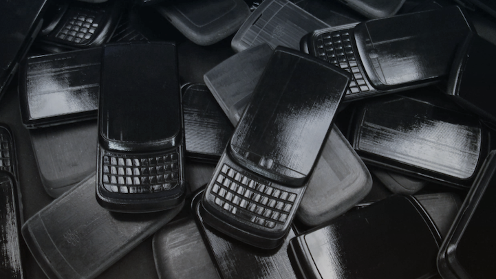
At almost any level, Research In Motion’s (RIM) Blackberry is an executive’s must-have accessory. The tried-and-true device has gone from a black-and-white messaging machine to essentially a handheld computer. Life + Times caught up with Todd Wood, RIM’s VP of Industrial Design, to thumb through the brand’s ethos on design and identity.
Life + Times: What’s BlackBerry’s overall approach to designing its products?
Todd Wood: With each design we are extending our family of products and, like family members, each has a unique character that appeals differently to our wide range of users. To define this character, we engage users to understand their likes, dislikes and how they feel about the products. From there, we create concepts and models for users to test and evaluate. This is “design in motion,” which is an iterative process of progressing, honing, and creating. We continue to evolve the design until we reach the optimal solution that has a distinguishing character and balances both science and art.
L+T: How has BlackBerry differentiated its design from its competitors?
TW: BlackBerry is a unique, valued, and highly recognizable brand and we have carved out a leadership position for our brand through what is now considered an iconic design. The BlackBerry look and feel combines display, navigation, and QWERTY keyboard elements in a symmetric composition. Our users have come to know these core elements of our brand and we remain true to them while stretching the boundaries to innovate and add a wow factor.
L+T: What was the approach to creating a touch-screen BlackBerry device?
TW: The value and benefit of touch interaction is direct manipulation of the content. And the challenge with touch is target size, primarily due to the size of our fingers. Our approach for weaving touch into the BlackBerry experience for Torch is a combination touch screen and an optical trackpad for fine navigation. When you use the BlackBerry Torch it feels very natural to touch the screen for gestures like swipe, while intuitively switching to fine navigation with the track pad for something like text editing.
L+T: What were the challenges in designing the Torch?
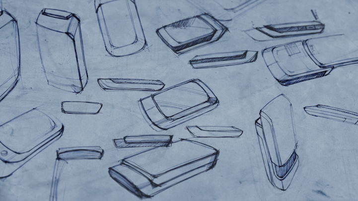
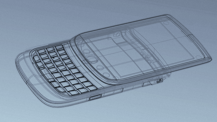
TW: The design for the BlackBerry Torch started with a challenging question: “How can we combine a large, brilliant display, touch user interface, our new BlackBerry 6 operating software and our industry leading QWERTY keyboard into a fresh but familiar product?” We took this challenge back to our labs and began to research, brainstorm, play, and test different concepts. After much research, analysis and design concepts, we decided that the vertical slider was the ideal answer. Once the design direction was locked down, the focus turned to making the form and function look and feel luxurious, strong, smooth and beautiful open and closed. This meant we had to make our signature keyboard extremely thin and strong enough to deliver the durability our customers expect. We designed a spring-loaded slider mechanism that is incredibly sleek, thin, and fluid, without compromising the precision, durability, or confidence of the iconic BlackBerry brand. The result was a unique transforming device that exudes “BlackBerry-ness.”
L+T: What’s the inspiration that goes into designing a BlackBerry?
TW: Our design team is inspired by many things, but it’s rarely the same thing twice. Inspiration can come from anywhere and at any time. Customer engagement is a primary source. Fashion trends also inspire our designs – watches, sunglasses, and shoes can all influence designs. We pay attention to the world around us to gain insight into what resonates with consumers and culture. A BlackBerry, like a car, is a reflection of the taste and style of the user.
L+T: How do you balance form and function for each BlackBerry?
TW: It is important to achieve the balance of form and function because if one overtakes the other, it compromises the experience. The BlackBerry design team thoughtfully integrates balance by using the iterative approach to design—modifying, refining, and testing to ensure the perfect balance of form and function. In this process you reach a point where you can’t take anything away or add more to the design.
L+T: Is there a correlation between the hardware design of a BlackBerry and the operating system?
TW: The BlackBerry Industrial Design team focuses primarily on hardware, but we work together with our software User Experience team with a shared brand vision in mind. In many ways we respect the fact that the hardware is fundamentally a vessel for content, and a stage for the user interface [UI] performance. Shape, color and iconography differentiate the various functions of the UI. With this in mind we choose hardware forms and finishes that complement the UI.
L+T: Since BlackBerry has become mainstream, how have the designs reflected that?
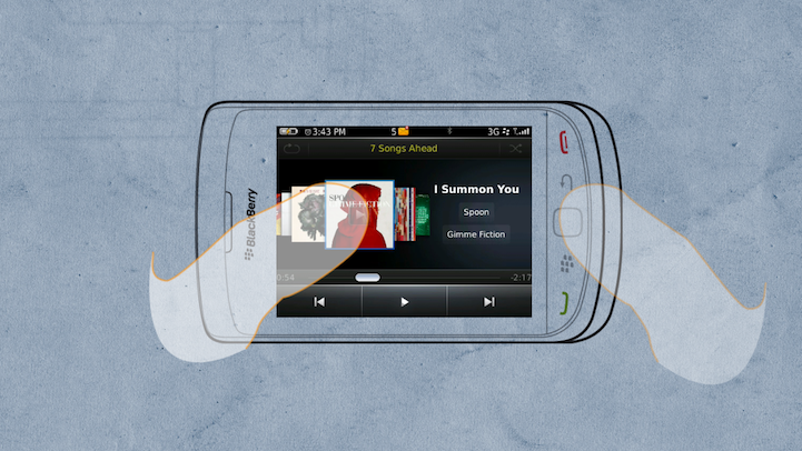
TW: The smartphone industry is undergoing rapid transformation and growth. Over the years, smartphones have evolved and expanded beyond corporate offices and have become part of consumers’ lives, and as this evolution has happened, smartphones broadened their features to include multimedia players, cameras and social networking capabilities. We’ve also seen how smartphones have become personal devices – ones that reflect individual styles and needs. This is one of the most exciting areas for my Industrial Design team – creating different form factors, finishes and designs that reflect individual styles and preferences. We’ve found that the smartphone market is definitely not a “one size fits all” industry and we’re constantly researching design trends and customer preferences when designing future BlackBerry smartphones. (BlackBerry)
