“You Should’ve Heard Just What I Seen” Examines The Relationship Between Art And Music
02.19.2014
ART & DESIGN
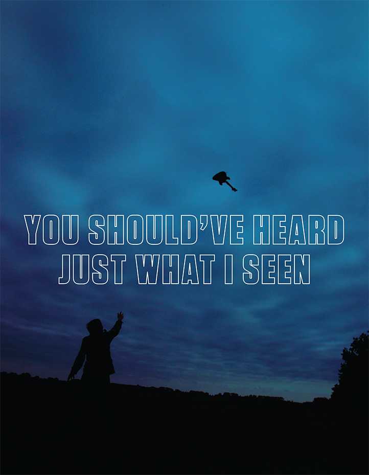
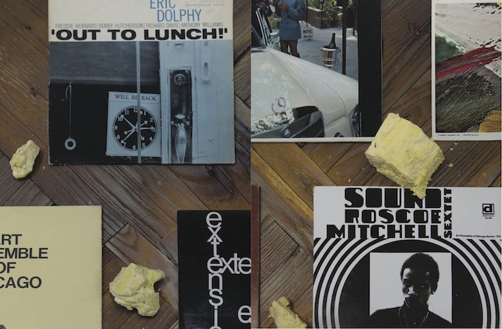
You Should’ve Heard Just What I Seen is a new publication that explores how music shapes the experience of making and looking at art, with original contributions from over 50 leading contemporary visual artists, musicians, and gallery curators. Invited to submit pieces that touch on the ways that music factors into both their lives and practice, the conversations, poems, essays, lists, show flyers, T-shirts, paintings, and photographs they provided are collected in this unprecedented reader on contemporary art and sound. Edited by Kelly Taxter, here, she shares her process about putting together her latest work.
Life+Times: How did you get involved with this publication?Kelly Taxter: I first met Marty and Rebecca Eisenberg, contemporary art collectors and philanthropists, in 2003. They were great supporters of my gallery Taxter & Spengemann (2003-2011) and over the years I became very familiar with the Eisenbergs and their collection. In early 2012 Marty invited me to curate an exhibition at Riverview School, a boarding school located in East Sandwhich, Massachusetts for children and young adults with cognitive disabilities and complex educational needs. The Eisenbergs built a gallery on Riverview campus, and regularly invited curators to present small exhibitions drawn from their collection. Roughly 50 artworks can fit in the space which is the first to greet visitors to the main building and is adjacent to the cafeteria and computer lab. The gallery is an unbelievable resource for students and faculty. Kids eat their sandwiches next to David Hammons and Elizabeth Peyton pieces, just to name two of the hundreds of artists in the collection. Music was a natural choice for the show, as Marty and I are both music nerds and art and music are integral to Riverview’s curriculum. [S0] it was only natural to bring them together. As I began to examine the collection and realize how many artists were musicians themselves or made work about or derived from music, it became clear that this small show was in fact a huge topic that needed an expanded platform. Marty proposed that we start working on a book and I took off from there.
L+T: How was the selection made?
KT: There were a few basic criteria: the artists had to be in the Eisenberg collection, the art dealers and Marty had an on-going dialog about art and life, and the curators practiced at institutions; like the Studio Museum in Harlem, that the Eisenbergs have long supported. From there it was mostly my knowledge about everyone’s art and other activities that guided who I reached out to. I’m lucky enough to know most of the contributors personally, or at least enough to have had a strong hunch about who would respond to the topic. Some artist’s interest in music is clearly on the surface of their artwork, like Brian DeGraw’s drawing of [reggae musician] Lee Scratch Perry. But Brian’s also an incredible musician, as part of Gang Gang Dance and [as a] solo [artist]. Other artist’s interest isn’t so obvious, but I know they’re obsessed with music like Friedrich Kunath who collaborated with David Berman (poet, and formerly of the band Silver Jews) and Michael Schmelling, a photographer who just so happens to have a Grammy for his artwork on Wilco’s A Ghost is Born album. It was also important to encourage unusual interpretation and collaboration, like Trisha Donnelly’s very mysterious Chinese kiln images, Spencer Sweeney talking with filmmaker and fellow DJ Matt Anderson, or musician Mike Watt (of bands Minutemen and fIREHOSE) writing about his old friend Raymond Pettibon. Pettibon made so many of Watt’s album covers, and the two have collaborated for years on all kinds of art, music and performances.
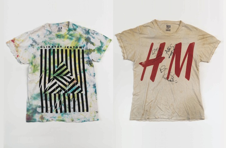
L+T: The end result is quite interesting, spanning poems, essays, lists, show flyers, t-shirts, paintings and photographs. What criteria did you provide these subjects when they submitted their works?
KT: I was careful not to impose any criteria. My invitation was simply to contribute your take on the intersection between art and music on up to 10 continuous pages. I gave feedback where it was wanted or pushed ideas into sharper focus if necessary. The way I worked with all of the contributors was a lot like my curatorial work; the artist always knows what they’re doing. It was up to me to bind the different voices together and communicate their ideas to the reader.
L+T: What about this project were you most excited about?
KT: Two things: telling my story and hearing everyone else’s. The only reason I know contemporary art exists is because of music – thank you Sonic Youth! Suburban Connecticut wasn’t a terrible place to grow up. It was close to the city and people were pretty savvy, but it was still the suburbs and if you were a curious teenager you had to figure out where to go, what to look at, read, listen to, etc. Me and my friends came together around music. It was our thing; our escape. We bought as many albums and saw as many shows as we could. When I read that Mike Kelley made the album art for Sonic Youth’s Dirty and Raymond Pettibon was on Goo, I needed to know just as much about those two artists as I did about the band. Suddenly art was way cooler than Monet and Picasso – not that those artists aren’t amazing- but Mike Kelley screamed right in my 16-year-old face. Being able to relay the important role music played (and still plays) in mine and the contributors lives revealed that we all shared this thing; a nugget of an experience or an idea that painted a much bigger picture – an artist, musician, curator, art dealer, or artwork coming into being because of restless creativity and relentless curiosity. It was very special to have this dialog with the contributors and makes everyone’s work even more intense and magical.

L+T: From the initial idea to final execution, how did the mission change? Or did it stay true to its origins?
KT: The biggest changes were design related as the contributions came in they warranted different types of visual handling. The mission of the book stayed on point but how designer Jesse Willenbring and I presented the wildly divergent material had to remain nimble, right up until the last minute. Similarly, I kept changing the sequence of contributions. Just like an album or an exhibition, the sequence of the songs or the installation of the artworks can tell a story or communicate a feeling just as strongly as each individual piece.
L+T: What message do you want people to take away from the book?
KT: To me, the overarching story of this book is about inspiration – what makes you want to create something, learn something, go make some noise with your friends, or hole up in your room with your headphones on, forgetting there’s all kinds of things you have to deal with… tomorrow.

