Visual Artist Pieter Ceizer Speaks On colette Collaboration and “Typofunk”
08.05.2013
ART & DESIGN
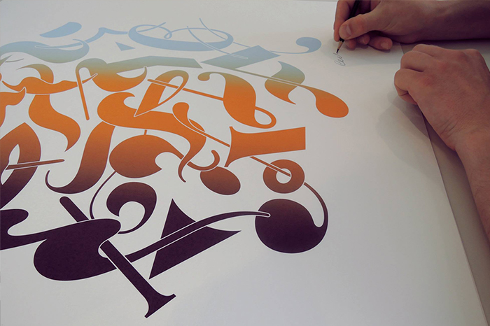
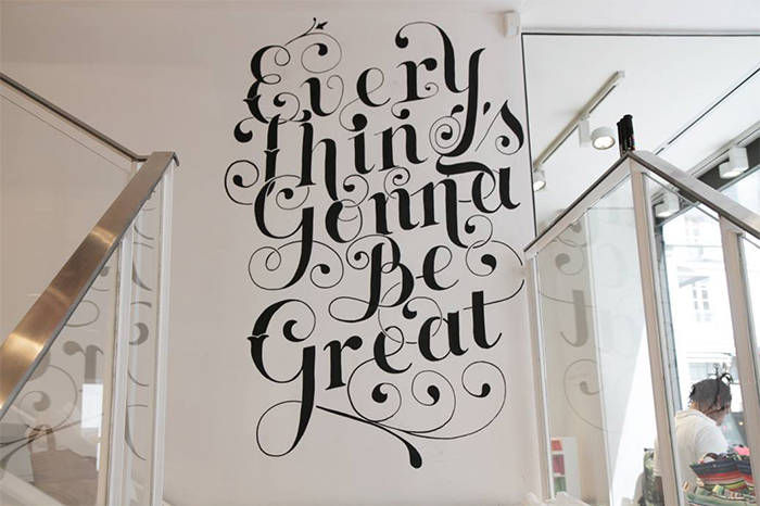
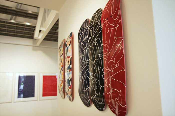
The “Wake Up” show exhibit currently showing at Paris’s famed boutique colette is a collection of sketch work, abstract typography and more classic typography created by artist and designer Pieter Ceizer. How he uniquely uses letters and colors and incorporates both along with inspirational phrases like “Everything’s Gonna Be Great” into his hand-drawn designs are on full display with “Wake Up.” That signature style can also be found throughout the Pieter Ceizer x colette Capsule Collection, which includes a T-shirt, hooded sweater, cap and a skate deck and was released in conjunction with the “Wake Up” show exhibit. Life+Times spoke with the Amsterdam-born, Paris-based artist about the “Wake Up” show, his new capsule collection with colette and why he feels his works are “Typofunk.”
Life+Times: Talk a little about the inspiration behind the “Wake Up” show exhibit.
Pieter Ceizer: I used to always draw phrases like “chase your dreams.” That was like my motto. I got to a point where some of my dreams were really becoming reality. I felt I had to be more focused and wake up. I always feel like the time is right now!

L+T: Words and letters are central components to your creations. In your opinion, why have words and letters been such a source of creativity for you?
PC: To me the truth is in letters. Typography is a way to express ideas and to communicate. When you read something you see a picture in your mind. With typography you can plant an idea in someone’s mind. I just hope to touch some people through words.
L+T: The “Wake Up” show features skate decks and pieces that seem to be somewhat inspired by graffiti. It’s known that you have roots in both skate culture and graffiti culture. How have both impacted you as an artist and as a person?
PC: When I was eleven I started skateboarding and hanging out with a lot of older cats. I learned about style, matching outfits and stuff like that. While doing graffiti I learned to express this rebellious spirit visually. Later in art school I specialized in lettering and learned more about how to think in an overall concept.
L+T: How did the Pieter Ceizer x colette Capsule Collection happen?
PC: My previous brand, PL Clothing was sold at colette, so that’s how they know my work. A year ago I was asked to do the first Tee of the Month and it ended up selling out within 24 hours. After that we exchanged some more ideas, which first resulted with the idea for a snapback cap with a “Chapeau” embroidery. Due to our enthusiasm with this first item, it finally grew into a capsule collection.
L+T: The capsule collection with colette isn’t your first foray into designing clothes. Your PL Clothing has been going strong for some time now. What made you want to get into designing clothes?
PC: First, I was drawing letters on jeans and jean jackets. I made all of my friends a pair of these jeans or a jacket, but I ended up being the only one actually wearing them. I guess it was a little too prominent [laughs]. After this I found that putting letters on t-shirts was the more accepted way to work.
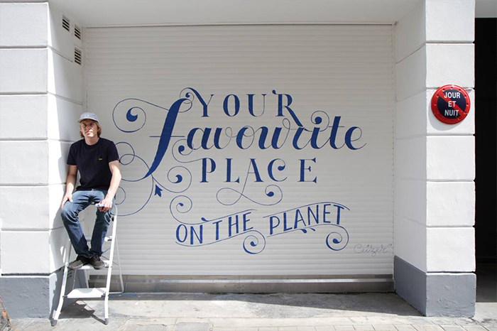
L+T: You’ve described what you do as “Typofunk.” What is Typofunk? How do your works embody Typofunk?
PC: Typofunk is visual funk made from typographical elements. Music makes you move your body and feel free, typofunk makes you move your mind and feel free.
L+T: You’re from Amsterdam and now you’re based in Paris. How have the two cities influenced your art?
PC: Amsterdam gave me the skateboard culture and Paris gave me ‘la vie sauvage’ or the wild life with an artistic and romantic charisma.
L+T: Were there any artists you were influenced by coming up?
PC: Sure. We got a lot of good artists in Amsterdam like Niels “Shoe” Meulman, Tiquestar, Parra, Sham and Our Machine. Both the work and life of Dutch painter and writer Jan Cremer have had a major impact on me.
